A fresh identity carried through a complete visual system. The Bocking Group project brings together a distinctive logo, blue and gold palette, brand guidelines, business cards and branded applications, alongside a new website design.
WHAT WE DID
Brand identity · Logo design · Brand guidelines · Graphic design · Website design & development
The design challenge
A brand identity has to hold together when it moves from a small business card to a folder, a screen or a piece of merchandise. For The Bocking Group, the design challenge was to create a recognisable identity with enough flexibility for both everyday communications and larger applications.
What we made
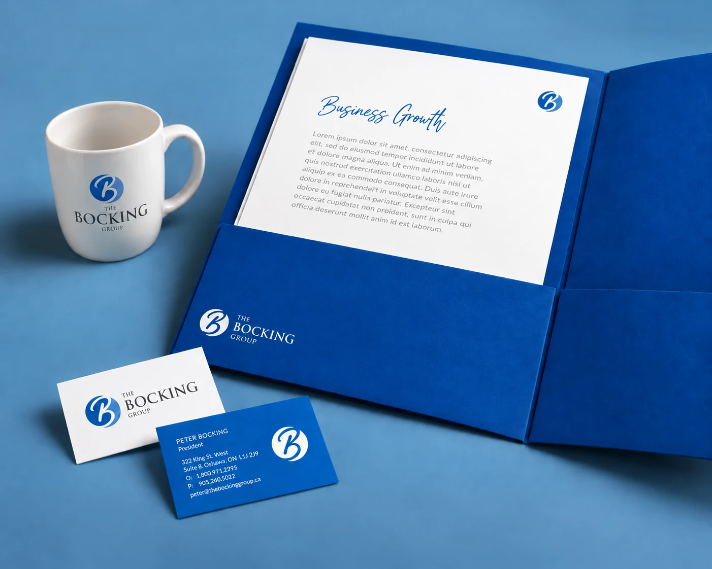
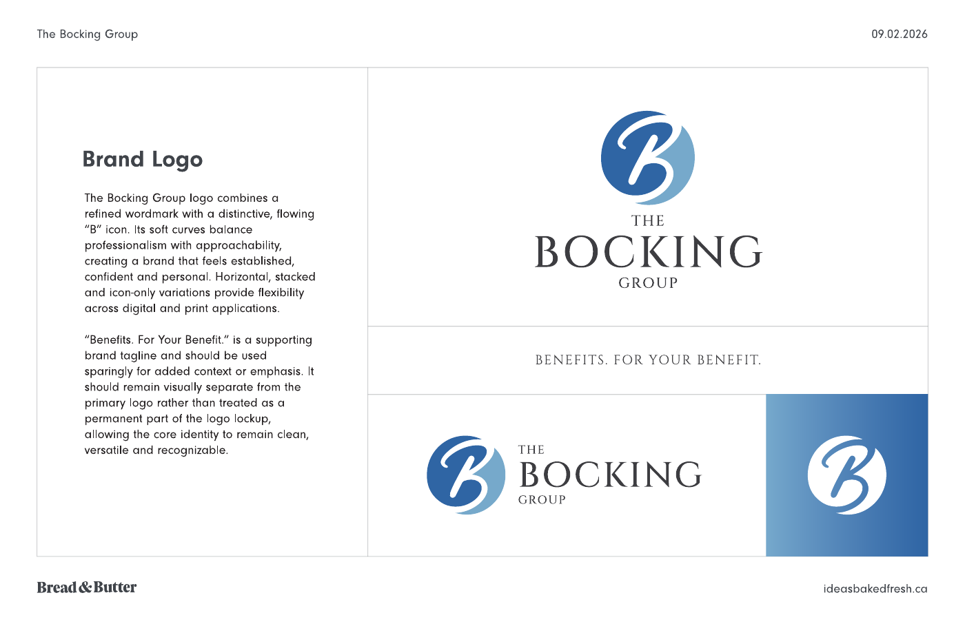
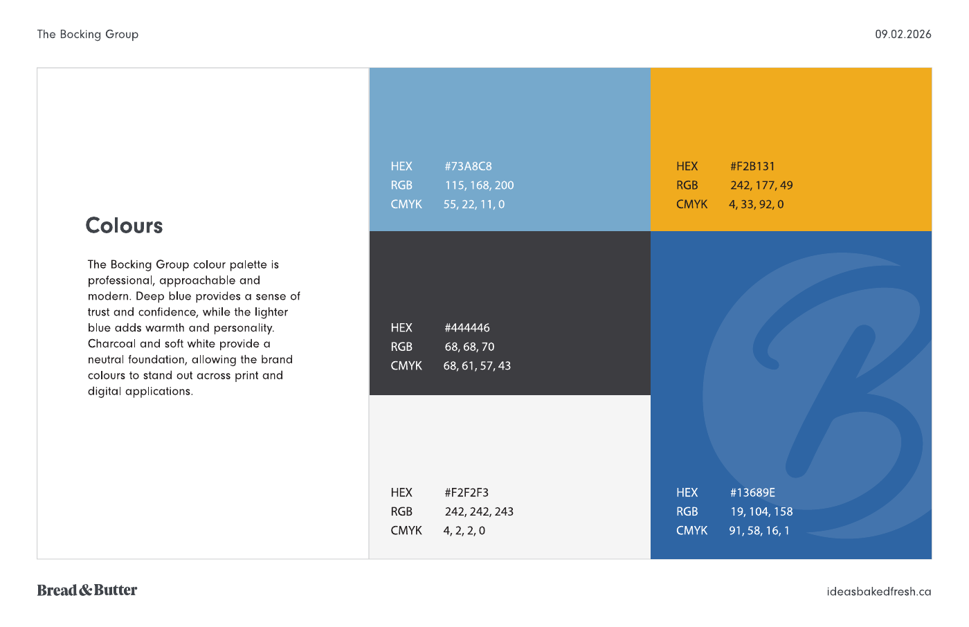
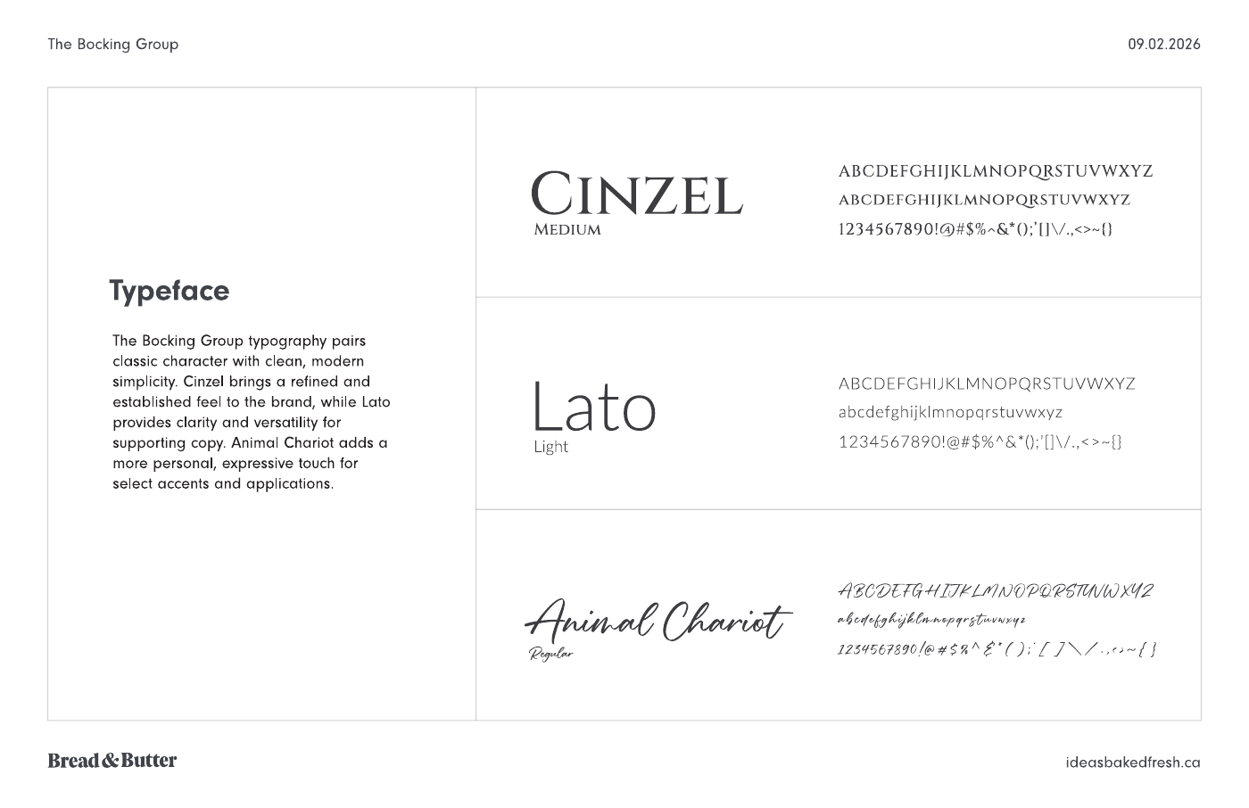
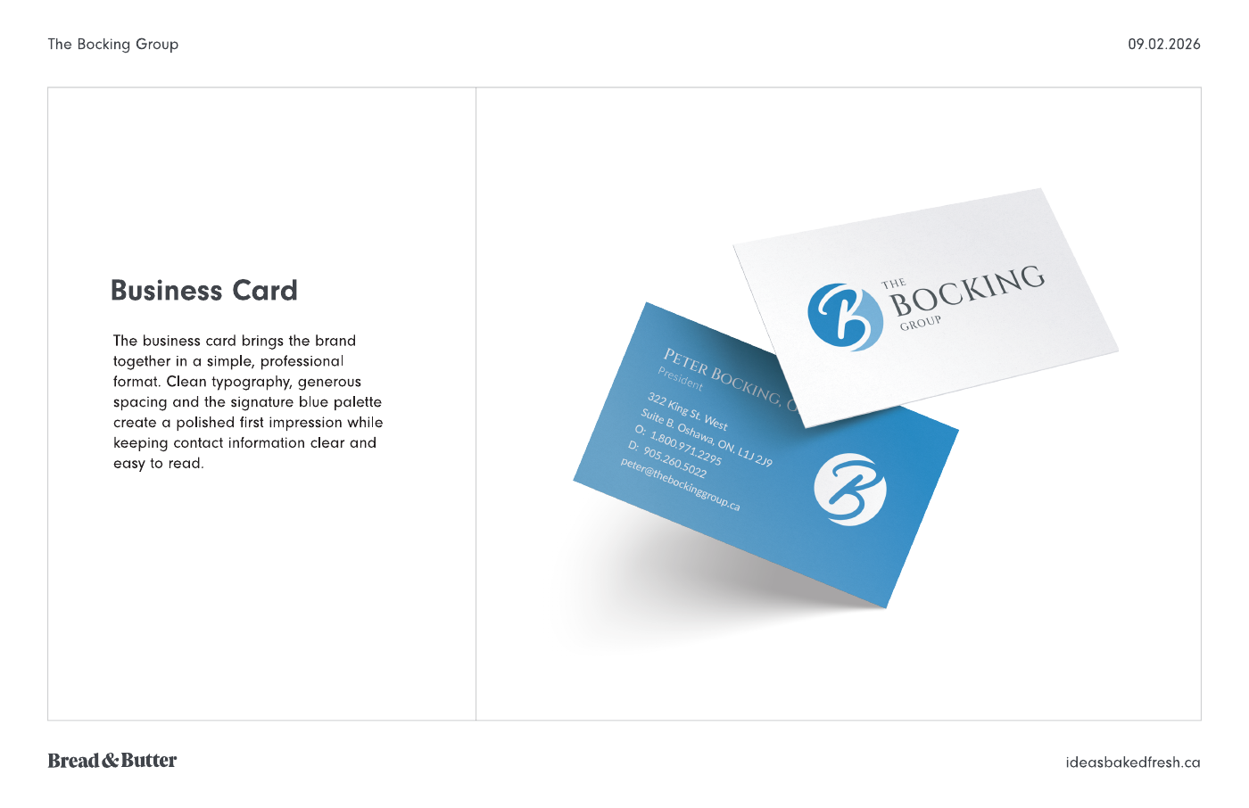
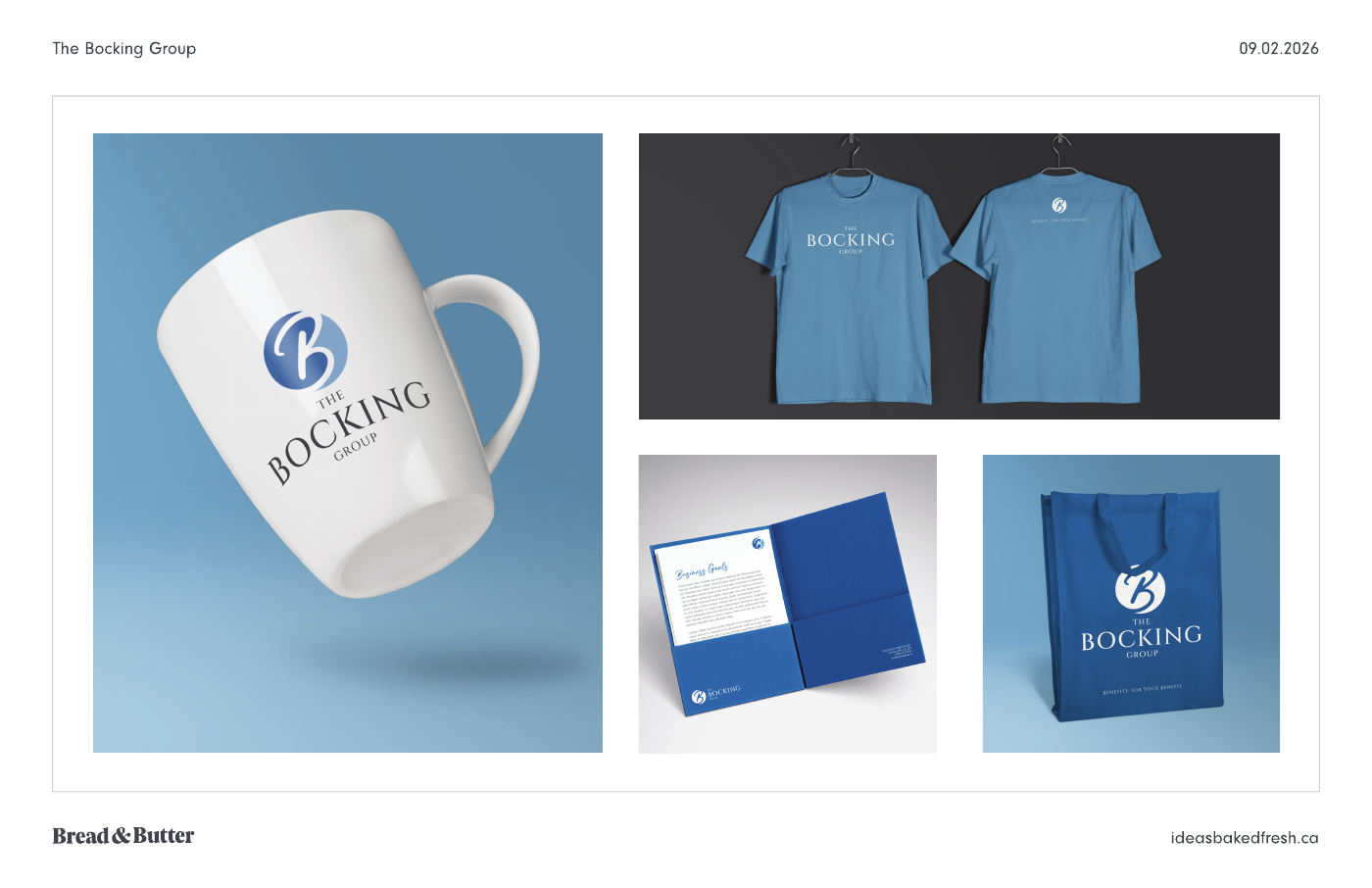
We built the identity around a distinctive B symbol and a refined wordmark. Blue, gold, charcoal and white form the colour palette, supported by defined typography and logo variations. The work extends into brand guidelines, business cards, presentation materials and a website design, with application mockups showing the system on merchandise.
The finished work
The finished set gives the brand a common visual language across print and digital design. The guidelines document the logo, colours and type, while the cards and application studies show how those choices work together. The application studies show how a single identity can take on different proportions and treatments while keeping its core character.
Talk to Bread & Butter about branding, graphic design or website design and development for your business in Durham Region, across Ontario or anywhere in Canada.