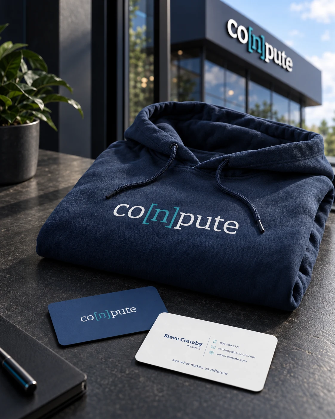
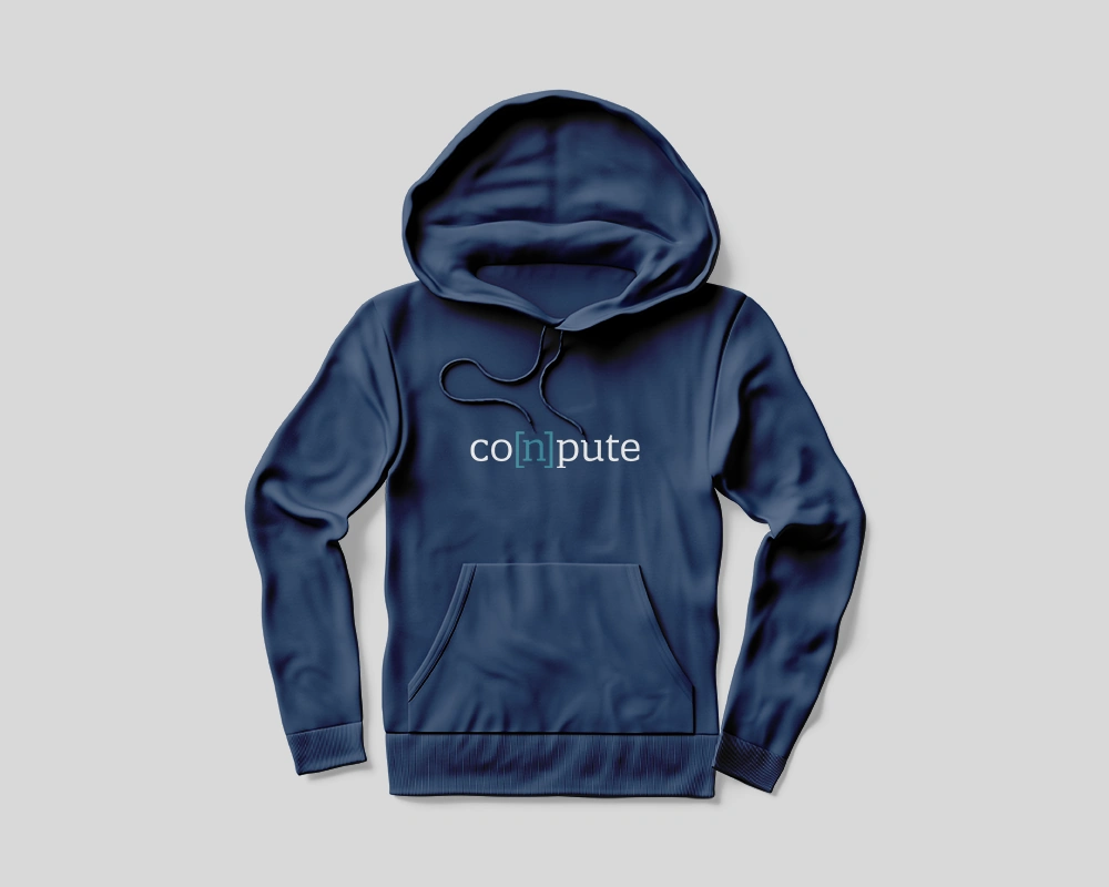
A distinctive bracketed wordmark, a blue and teal palette, and a flexible visual system applied across business cards, signage, social graphics and apparel.
WHAT WE DID
Logo design · Visual identity · Social graphics · Print & signage · Apparel
The design challenge
A technology brand needs to be identifiable in both small digital spaces and larger physical applications. Conpute’s design challenge was to build a visual system around the name that could remain clear on social graphics, printed materials, clothing and signage.
What we made
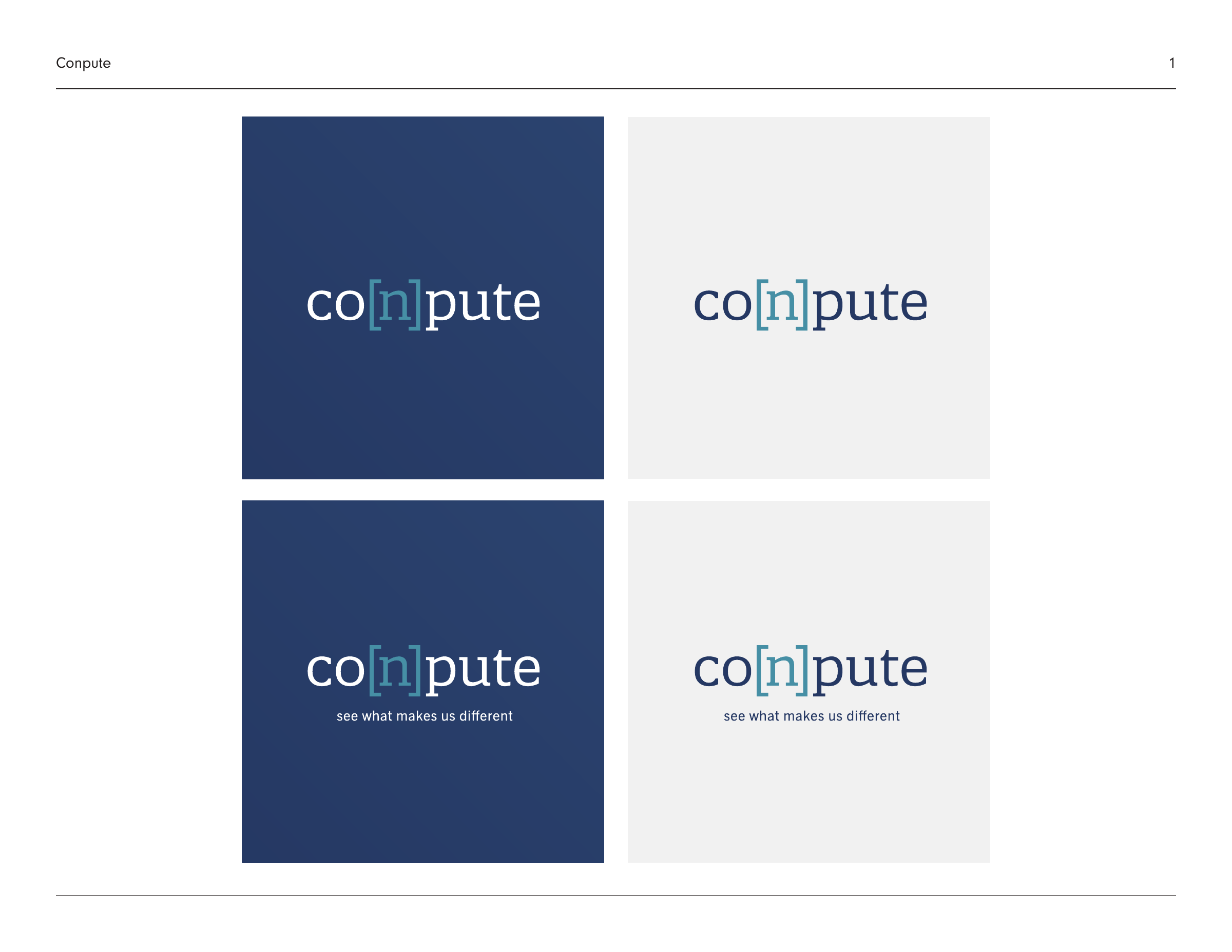
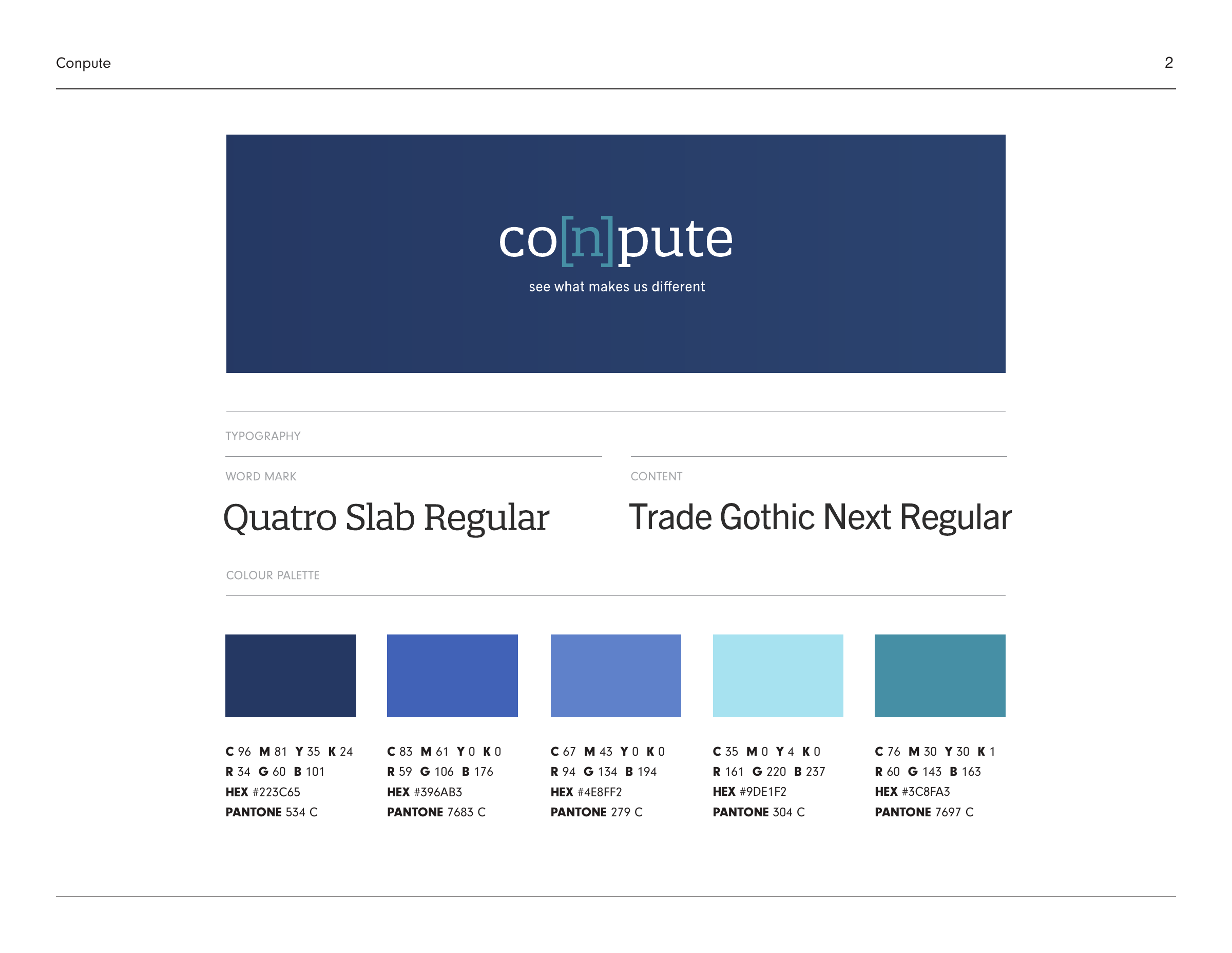
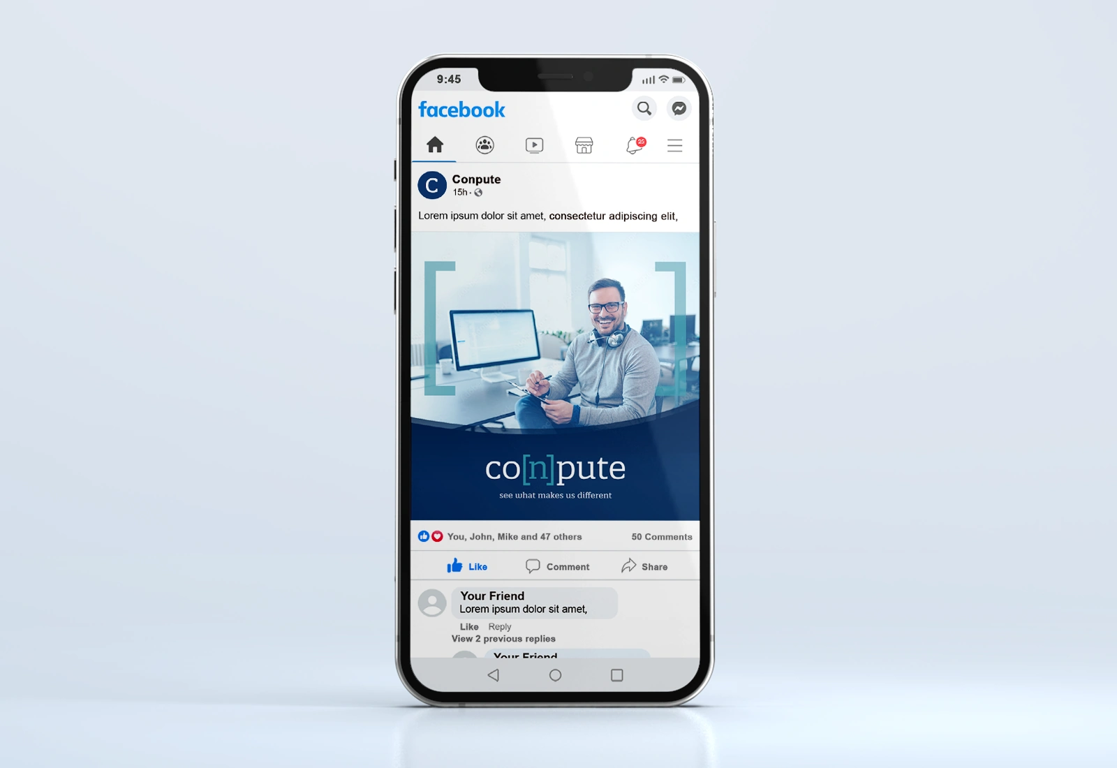
We created a bracketed wordmark with blue and teal as the core colours. Logo variations, typography and colour guidance establish the visual system. The application work explores business cards, social media graphics, building signage and apparel, carrying the same recognisable details from one format to the next.
The finished work
The completed identity and application studies show a consistent relationship between the wordmark, palette and supporting typography. The gallery brings the guidelines and mockups together so the design can be assessed across several contexts. The wordmark remains the focal point, with supporting colours and layouts adapting to each application rather than requiring a different identity for every medium.
Talk to Bread & Butter about branding, graphic design or website design and development for your business in Durham Region, across Ontario or anywhere in Canada.