A confident identity for J. Leroy Gallant Insurance, pairing distinctive typography with magenta and deep blue across logo variations, printed materials and signage.
WHAT WE DID
Logo design · Brand guidelines · Print design · Signage
The design challenge
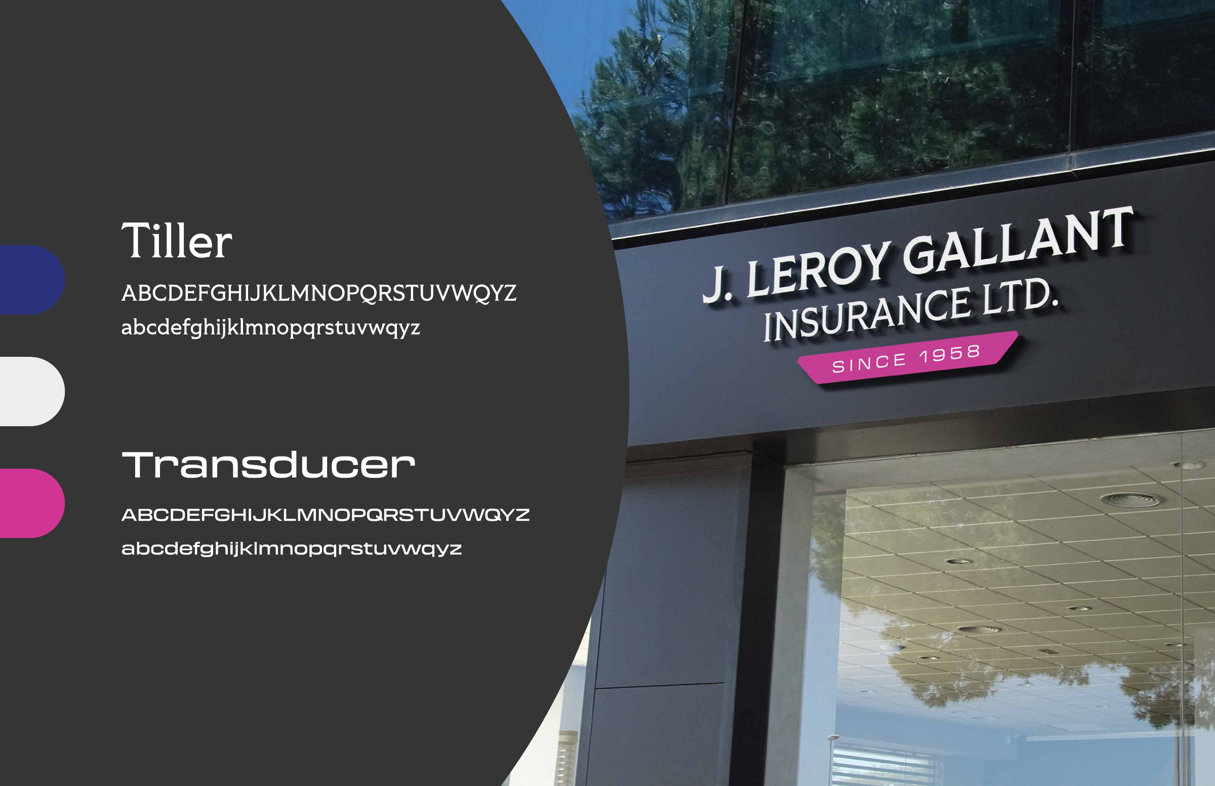
An insurance identity needs to feel established while remaining recognisable across everyday materials and public-facing signage. For J. Leroy Gallant, the design challenge was to create a consistent typographic identity that could work on a business card as well as on a building.
What we made
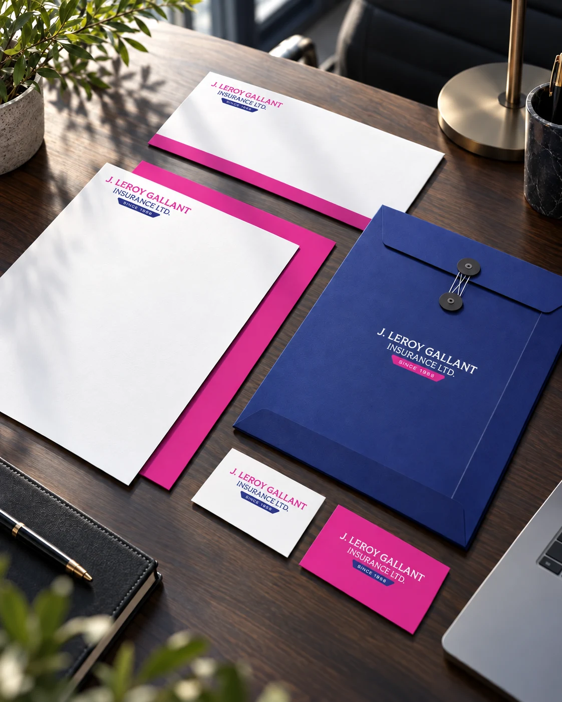
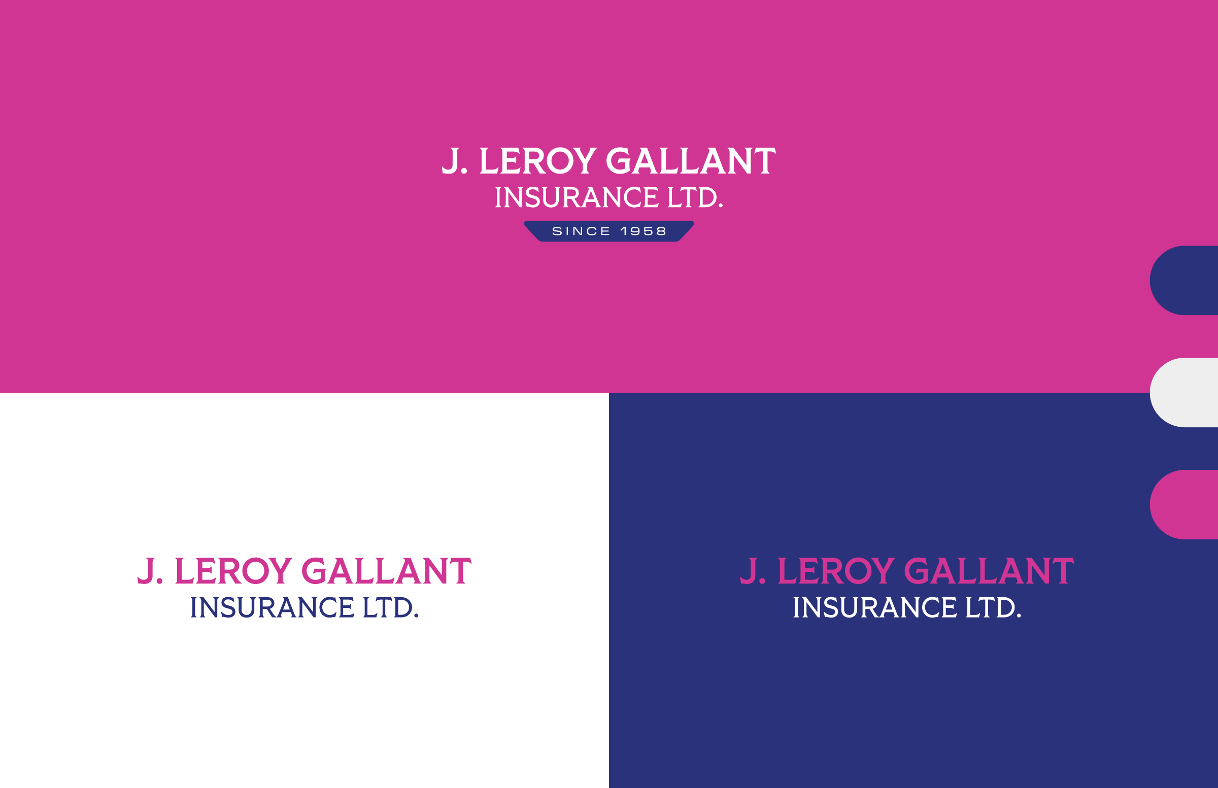
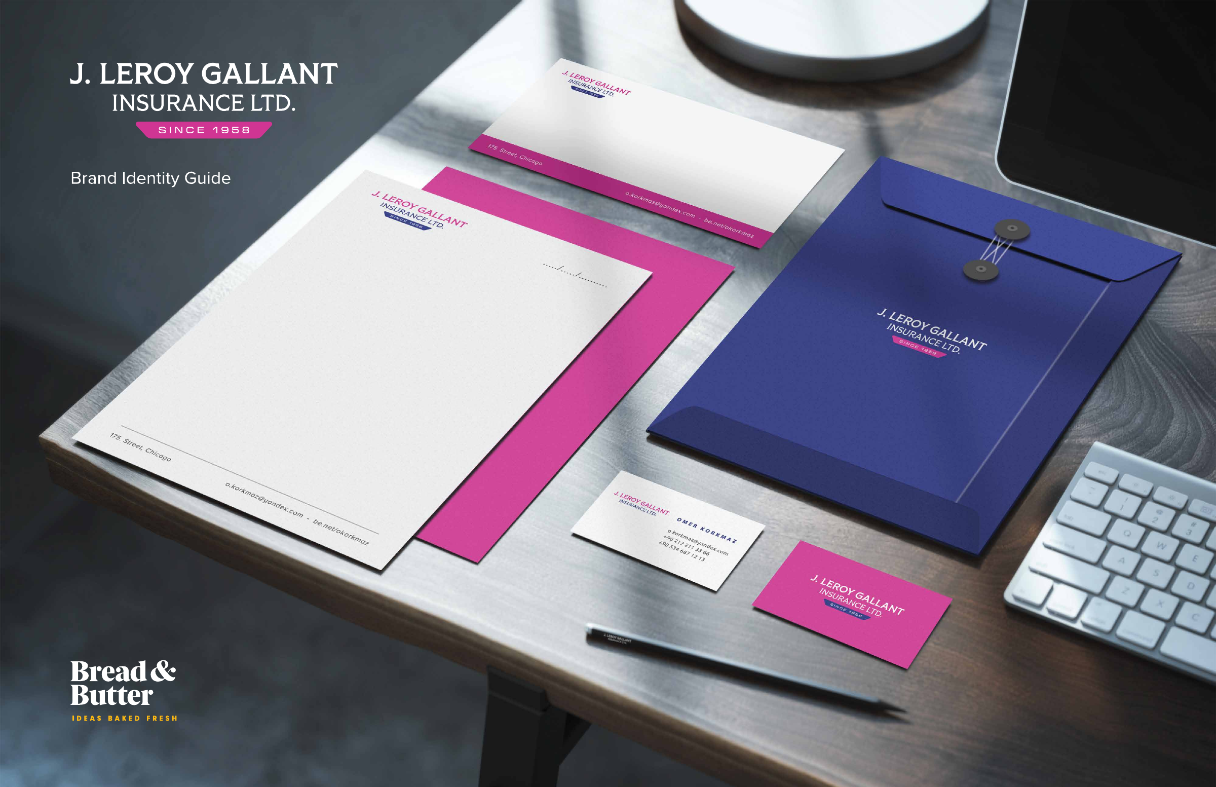
We developed logo variations using distinctive lettering with magenta, deep blue and white treatments. Brand guidelines bring the colour and typography choices together. The work extends into printed materials and signage, with application studies showing how the identity behaves at different sizes and against light and dark backgrounds.
The finished work
The finished system connects the wordmark, colour treatments and applications through a common set of design choices. The gallery includes the primary and reversed logos, colour system, stationery studies and signage. Together they show how the name and colour palette can stay recognisable as the scale and background change.
Talk to Bread & Butter about branding, graphic design or website design and development for your business in Durham Region, across Ontario or anywhere in Canada.